手把手教你實現微信小程序中的自定義組件
|
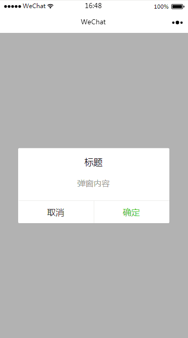
之前做小程序開發的時候,對于開發來說比較頭疼的莫過于自定義組件了,當時官方對這方面的文檔也只是寥寥幾句,一筆帶過而已,所以寫起來真的是非常非常痛苦!! 好在微信小程序的庫從 1.6.3 開始,官方對于自定義組件這一塊有了比較大的變動,首先比較明顯的感覺就是文檔比以前全多了,有木有!(小程序文檔),現在小程序支持簡潔的組件化編程,可以將頁面內的功能模塊抽象成自定義組件,以便在不同的頁面中復用,提高自己代碼的可讀性,降低自己維護代碼的成本! 本篇文章就是手把手教你實現小程序中自定義組件,坐穩啦~ 具體實現要做自定義組件,我們先定一個小目標,比如說我們在小程序中實現一下 WEUI 中的彈窗組件,基本效果圖如下。
Step1
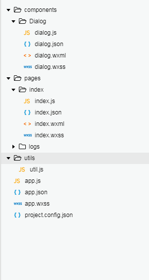
我們初始化一個小程序(本示例基礎版本庫為 1.7 ),刪掉里面的示例代碼,并新建一個
Step2
組件初始化工作準備完成,接下來就是組件的相關配置,首先我們需要聲明自定義組件,也就是將
{
  "component": true,        // 自定義組件聲明
  "usingComponents": {}     // 可選項,用于引用別的組件
}
其次,我們需要在
<view class='wx_dialog_container' hidden="{{!isShow}}">
    <view class='wx-mask'>view>
    <view class='wx-dialog'>
        <view class='wx-dialog-title'>{{ title }}view>
        <view class='wx-dialog-content'>{{ content }}view>
        <view class='wx-dialog-footer'>
          <view class='wx-dialog-btn' catchtap='_cancelEvent'>{{ cancelText }}view>
          <view class='wx-dialog-btn' catchtap='_confirmEvent'>{{ confirmText }}view>
        view>
    view>
view>
/* components/Dialog/dialog.wxss */
.wx-mask{
  position: fixed;
    z-index: 1000;
    top: 0;
    right: 0;
    left: 0;
    bottom: 0;
    background: rgba(0, 0, 0, 0.3);
}
.wx-dialog{
    position: fixed;
    z-index: 5000;
    width: 80%;
    max-width: 600rpx;
    top: 50%;
    left: 50%;
    -webkit-transform: translate(-50%, -50%);
    transform: translate(-50%, -50%);
    background-color: #FFFFFF;
    text-align: center;
    border-radius: 3px;
    overflow: hidden;
}
.wx-dialog-title{
    font-size: 18px;
    padding: 15px 15px 5px;
}
.wx-dialog-content{
    padding: 15px 15px 5px;
    min-height: 40px;
    font-size: 16px;
    line-height: 1.3;
    word-wrap: break-word;
    word-break: break-all;
    color: #999999;
}
.wx-dialog-footer{
    display: flex;
    align-items: center;
    position: relative;
    line-height: 45px;
    font-size: 17px;
}
.wx-dialog-footer::before{
    content: '';
    position: absolute;
    left: 0;
    top: 0;
    right: 0;
    height: 1px;
    border-top: 1px solid #D5D5D6;
    color: #D5D5D6;
    -webkit-transform-origin: 0 0;
    transform-origin: 0 0;
    -webkit-transform: scaleY(0.5);
    transform: scaleY(0.5);
}
.wx-dialog-btn{
    display: block;
    -webkit-flex: 1;
    flex: 1;
    -webkit-tap-highlight-color: rgba(0, 0, 0, 0);
    position: relative;
}
.wx-dialog-footer .wx-dialog-btn:nth-of-type(1){
    color: #353535;
}
.wx-dialog-footer .wx-dialog-btn:nth-of-type(2){
    color: #3CC51F;
}
.wx-dialog-footer .wx-dialog-btn:nth-of-type(2):after{
    content: " ";
    position: absolute;
    left: 0;
    top: 0;
    width: 1px;
    bottom: 0;
    border-left: 1px solid #D5D5D6;
    color: #D5D5D6;
    -webkit-transform-origin: 0 0;
    transform-origin: 0 0;
    -webkit-transform: scaleX(0.5);
    transform: scaleX(0.5);
}
step3
組件的結構和樣式都有了,還缺少什么呢,沒錯,還缺
下面我通過代碼注釋解釋一下構造器中的一些屬性的使用:
// components/Dialog/dialog.js
Component({
  options: {
    multipleSlots: true // 在組件定義時的選項中啟用多slot支持
  },
  /**
   * 組件的屬性列表
   * 用于組件自定義設置
   */
  properties: {
    // 彈窗標題
    title: {            // 屬性名
      type: String,     // 類型(必填),目前接受的類型包括:String, Number, Boolean, Object, Array, null(表示任意類型)
      value: '標題'     // 屬性初始值(可選),如果未指定則會根據類型選擇一個
    },
    // 彈窗內容
    content :{
      type : String ,
      value : '彈窗內容'
    },
    // 彈窗取消按鈕文字
    cancelText :{
      type : String ,
      value : '取消'
    },
    // 彈窗確認按鈕文字
    confirmText :{
      type : String ,
      value : '確定'
    }
  },

  /**
   * 私有數據,組件的初始數據
   * 可用于模版渲染
   */
  data: {
    // 彈窗顯示控制
    isShow:false
  },

  /**
   * 組件的方法列表
   * 更新屬性和數據的方法與更新頁面數據的方法類似
   */
  methods: {
    /*
     * 公有方法
     */

    //隱藏彈框
    hideDialog(){
      this.setData({
        isShow: !this.data.isShow
      })
    },
    //展示彈框
    showDialog(){
      this.setData({
        isShow: !this.data.isShow
      })
    },
     /*
     * 內部私有方法建議以下劃線開頭
     * triggerEvent 用于觸發事件
     */
    _cancelEvent(){
      //觸發取消回調
      this.triggerEvent("cancelEvent")
    },
    _confirmEvent(){
      //觸發成功回調
      this.triggerEvent("confirmEvent");
    }
  }
})
step4
截至目前為止,你應該完成了一個自定義彈窗組件的大部分,可是你保存后并沒有發現任何變化,因為我們還需要在
首先需要在
{
  "usingComponents": {
    "dialog": "/components/Dialog/dialog"
  }
}
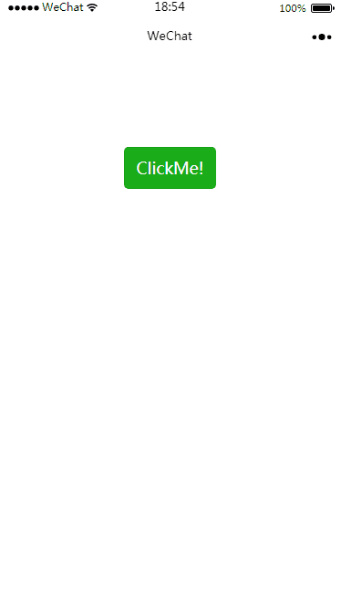
然后我們在
<view class="container">
    <dialog id='dialog'
      title='我是標題'
      content='恭喜你,學會了小程序組件'
      cancelText='知道了'
      confirm='謝謝你'
      bind:cancelEvent="_cancelEvent"
      bind:confirmEvent="_confirmEvent">
    dialog>

    <button type="primary" bindtap="showDialog"> ClickMe! button>
view>
嗯哪,還差最后一步,
//index.js
//獲取應用實例
const app = getApp()

Page({

  /**
 * 生命周期函數--監聽頁面初次渲染完成
 */
  onReady: function () {
    //獲得dialog組件
    this.dialog = this.selectComponent("#dialog");
  },

  showDialog(){
    this.dialog.showDialog();
  },

   //取消事件
  _cancelEvent(){
    console.log('你點擊了取消');
    this.dialog.hideDialog();
  },
  //確認事件
  _confirmEvent(){
    console.log('你點擊了確定');
    this.dialog.hideDialog();
  }

})
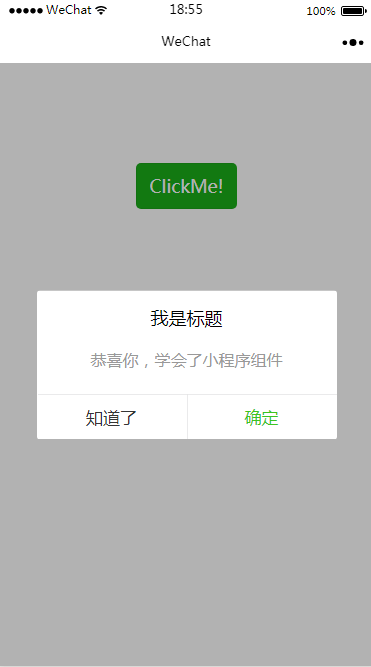
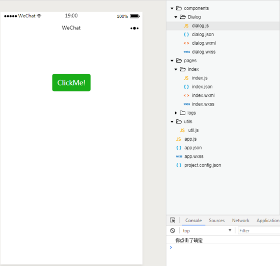
到此!大功告成! step5讓我們測試一下試試看:
點擊按鈕之后呢,會出現如下效果:
點擊取消或者確定按鈕的話,我們在事件中設置了彈窗會關閉,并會打印出相應的信息,具體點擊完應該怎么做,就看你們自己發揮了,我只能幫你到這里了~
總結現在,你已經基本掌握了小程序中的自定義組件開發技巧,怎么樣,是不是很棒,應該給自己點個贊,打個call。 總體來說,小程序推出自定義組件后,感覺方便了很多,還沒有 get 的小伙伴們,趕緊學習學習,以后多用組件化開發,就不會那么難受了,加油哦~ |