|
在Page頂部下滑一個提示條 , 代碼見 /mixins/UIComponent.js ,其中的self 可以認為是微信小程序的Page對象
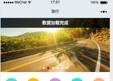
效果: 默認2秒展示,上移動畫隱藏
-
/**
-
* 展示頂部 tip , 多次快速調用,會覆蓋前次展示
-
*/
-
UIComponent.showToptip = function (opt = {}) {
-
var self = this;
-
if (self.uiComponent_topTip_timer) { //如果之前有timer,那么取消后重新創(chuàng)建
-
clearTimeout(self.uiComponent_topTip_timer);
-
}
-
if (typeof opt == "string") {
-
opt = {
-
content: opt
-
}
-
}
-
//默認參數(shù),也是外部參考的傳參
-
var defaultOptions = {
-
show: false, //是否顯示,默認不顯示
-
style: "", //外部傳入的自定義樣式,比如字體,背景色
-
content: "操作成功", //默認的內容
-
duration: 2000 //顯示延遲幾秒
-
};
-
let app = getApp();
-
opt = app.util.extend(defaultOptions, opt);
-
self.setData({
-
'uiComponent.toptip.show': true,
-
'uiComponent.toptip.style': opt.style,
-
"uiComponent.toptip.content": opt.content
-
});
-
self.uiComponent_topTip_timer = setTimeout(() => {
-
self.setData({
-
'uiComponent.toptip.show': false
-
});
-
}, opt.duration);
-
}
-
<view class="uiComponent uiComponent_toptip uiComponent_toptip_{{uiComponent.toptip.show &&'active'}}"
-
style="{{uiComponent.toptip.style}}"
-
-
>{{uiComponent.toptip.content}} </view>
-
.uiComponent {
-
z-index: 110;
-
}
-
/* toptip 頂部提示條效果 */
-
.uiComponent_toptip {
-
width: 100%;
-
display: block;
-
top:-50px;
-
position: fixed; text-align: center;
-
line-height: 2.3;
-
font-size: 30rpx;
-
transition: all .2s linear ;
-
}
-
-
.uiComponent_toptip_active {
-
top:0;
-
transition: all .3s linear ;
-
min-height: 32px;
-
color: #fff;
-
background-color: rgba(0,0,0,.8);
-
}
|