開(kāi)發(fā)小程序折疊面板
參考了一系列的小程序UI庫(kù)。。。,最后參考了ant-design的折疊面板(collapse)組件設(shè)計(jì),功能大致如下
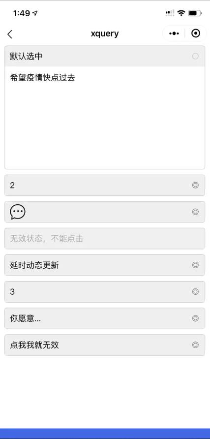
- 支持默認(rèn)展開(kāi)
- 動(dòng)態(tài)設(shè)置標(biāo)簽欄
- 動(dòng)態(tài)設(shè)置內(nèi)容
- 支持無(wú)效狀態(tài)
- 支持切換響應(yīng)方法
戳源碼
構(gòu)思
折疊面板組件由列表組件(ui-list)實(shí)現(xiàn),列表項(xiàng)作為標(biāo)簽頁(yè),列表項(xiàng)子元素 content 作為彈出層,數(shù)據(jù)子項(xiàng)結(jié)構(gòu)大致如下
{
    title: '標(biāo)簽標(biāo)題',
    content: '彈層內(nèi)容'
}
復(fù)制代碼
列表組件
構(gòu)建一個(gè)動(dòng)態(tài)組件 ui-list ,通過(guò)配置文件實(shí)現(xiàn)列表結(jié)構(gòu),將如下這段數(shù)據(jù)結(jié)構(gòu)
const mockData = [
  {title: '列表項(xiàng)1', content: '彈層內(nèi)容1'},
  {title: '列表項(xiàng)2', content: '彈層內(nèi)容2'},
  {title: '列表項(xiàng)3', content: '彈層內(nèi)容3'},
]
復(fù)制代碼
生成大致如下的wxml
<view class="list-container">
    <view class="item">
      <view class="title">列表項(xiàng)1</view>
      <view class="content">彈層內(nèi)容1</view>
    </view>
    <view class="item">
      <view class="title">列表項(xiàng)2</view>
      <view class="content">彈層內(nèi)容2</view>
    </view>
    <view class="item">
      <view class="title">列表項(xiàng)3</view>
      <view class="content">彈層內(nèi)容3</view>
    </view>
</view>
復(fù)制代碼
通過(guò)css樣式,將彈層內(nèi)容 <view class="content"> 隱藏
交互設(shè)計(jì)
彈出設(shè)計(jì)
<view class='title'> 作為展示標(biāo)簽,也作為點(diǎn)擊事件的主體,當(dāng)點(diǎn)擊標(biāo)簽時(shí)為 <view class='item'> 的子容器添加 active 激活樣式,此時(shí)彈層內(nèi)容通過(guò)樣式設(shè)計(jì)為 display: block 狀態(tài),即實(shí)現(xiàn)彈出顯示
<view class="item active">
  <view class="title" bind:tap="change">列表項(xiàng)1</view>
  <view class="content">彈層內(nèi)容1</view> <!--css display block-->
</view>
復(fù)制代碼
更新設(shè)計(jì)
為標(biāo)簽點(diǎn)擊時(shí)提供 changeTitle,changeContent 方法,通過(guò)關(guān)鍵字段尋址,并更新數(shù)據(jù),從而更新wxml結(jié)構(gòu),如下列的思路
<view class="title" bind:tap="change" data-index="1">列表項(xiàng)1</view>
復(fù)制代碼
change(e){
  const ds = e...dataset
  this.toggleActive(e)
  this.changeTitle(ds, ...) // 或者 this.changeContent(e, ...)
}
changeTitle(ds, param) {
  let index = ds.index
  let $data = findIt(index)
  $data.title = param
  this.setData({config.data[index]: ....})
}
changeContent(ds, param) {
  // 思路同changeTitle
}
復(fù)制代碼
上面所述是簡(jiǎn)化邏輯,實(shí)現(xiàn)起來(lái)并不如此簡(jiǎn)單,尤其是尋址邏輯和更新邏輯
實(shí)現(xiàn)及應(yīng)用
wxml
<ui-list wx:if="{{collapsConfig}}" list="{{collapsConfig}}" />
復(fù)制代碼
js
let config = {
  listClass: 'collapse-pad',
  data: [],
  tap: function(param){ // 切換響應(yīng)方法,樣式操作封裝在組件內(nèi)部
    // this.title({...})
    // this.content({...})
    // this.disabled(true|false)
  }
}

Page({
  data: {
    collapsConfig: config
  }
})
復(fù)制代碼
關(guān)于動(dòng)態(tài)標(biāo)簽的一點(diǎn)想法
動(dòng)態(tài)標(biāo)簽的好處是可以將邏輯、尋址等在JS部分來(lái)實(shí)現(xiàn),相較于 template 語(yǔ)法,動(dòng)態(tài)標(biāo)簽的方式靈活太多了,能方便的實(shí)現(xiàn)組件化、模塊化,規(guī)范化,和將公共部分抽離,且易于維護(hù)。當(dāng)一個(gè)項(xiàng)目有多人維護(hù)時(shí),碎片模板是一個(gè)地獄。