微信小程序-自定義NavBar組件(1)
|
最近公司項目忙得不可開交,各種不可描述的事情,然后學習基本停機。這個周末沒出去浪,就在家把之前王夫人給我設計的小程序做了做,然后一步步分享做的過程中遇到的問題和積累,希望大家爬坑過程中能幫到一些吧 組件化組件化本身是一個可以講的很大,也可以濃縮為 封裝可復用的,模版組件 基于mvvm的微信小程序當然也支持這一特性,我們做項目的時候也可以把注入公用的header footer之類的封一封(其實工具類的組裝也可以作為組件化的一種形式) 小程序的組件化挺有意思的基于Component,自行實現了一套比較深的實現(這篇不講實現),第一次看感覺跟Page好,或者說是換湯不換藥。但內部組件(頁面)的生命周期,事件處理等有自己的特點,這個之后再寫的時候再提吧 然后微信,本身的sample已經寫清楚了一些要素,那我這邊也就在這個基礎上做發散,官方傳送門如下: https://developers.weixin.qq.com/miniprogram/dev/framework/custom-component/ 目錄結構這邊貼一下代碼結構
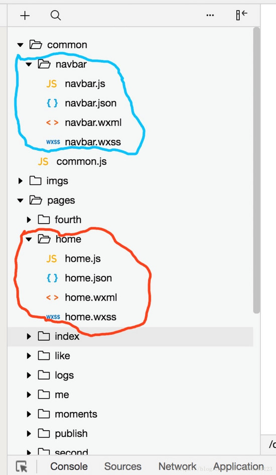
藍色是自定義的組件(啊呀,好像沒取components/nav這類名字) 紅色是引用他的首頁 設計圖長這樣
做的長這樣(UI還沒調,效果先實現吧,反正大家也就看個思路,長啥樣無所謂了)
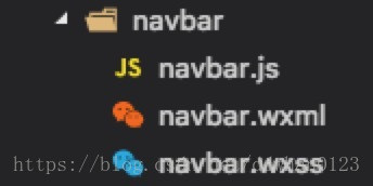
實現功能來源是 https://github.com/Tencent/weui-wxss 組件庫中提取出來的,我做的工作就是把本來Page頁面改成Component,然后給大家理一理過程。 首先是提取功能代碼在 dist/example/navbar目錄下,有3個文件
我們先完全copy過來,然后添加一個navbar.json文件 navbar.json
{
  "component": true,
  "usingComponents": {}
}
如果有用到其他組件,那就定義一下,沒有的話可以不管。 component要為true。(證明我是誰嘛,這個好理解) 因為設計圖只需要2個tab頁,所以把navbar.wxml文件進行了微調(沒有重要步驟的我就不多做解釋了)
<view class="page">
    <view class="page__bd">
        <view class="weui-tab">
            <view class="weui-navbar">
                <block wx:for="{{tabs}}" wx:key="*this">
                    <view id="{{index}}" class="weui-navbar__item {{activeIndex == index ? 'weui-bar__item_on' : ''}}" bindtap="tabClick">
                        <view class="weui-navbar__title">{{item}}</view>
                    </view>
                </block>
                <view class="weui-navbar__slider" style="left: {{sliderLeft}}px; transform: translateX({{sliderOffset}}px); -webkit-transform: translateX({{sliderOffset}}px);"></view>
            </view>
            <view class="weui-tab__panel">
                <view class="weui-tab__content" hidden="{{activeIndex != 0}}">PHOTO</view>
                <view class="weui-tab__content" hidden="{{activeIndex != 1}}">BLOG</view>
            </view>
        </view>
    </view>
</view>
這邊任意一個點擊都會觸發tabClick()這個方法 class=”weui-navbar__slider”的這個view用來繪制內容偏移的動畫 樣式這塊,空間本身有一些屬性,然后微信這套設計有一個自己的風格,復制的時候從多個地方扣過來。 navbar.wxss
/*!
 * WeUI v1.1.1 (https://github.com/weui/weui-wxss)
 * Copyright 2017 Tencent, Inc.
 * Licensed under the MIT license
 */

.weui-navbar {
  margin-top: 50px;
  display: -webkit-box;
  display: -webkit-flex;
  display: flex;
  position: absolute;
  z-index: 500;
  top: 0;
  width: 100%;
  border-bottom: 1rpx solid #ccc;
}

.weui-navbar__item {
  position: relative;
  display: block;
  -webkit-box-flex: 1;
  -webkit-flex: 1;
  flex: 1;
  padding: 13px 0;
  text-align: center;
  font-size: 0;
}

.weui-navbar__item.weui-bar__item_on {
  color: #F5CD79;
}

.weui-navbar__slider {
  position: absolute;
  content: " ";
  left: 0;
  bottom: 0;
  width: 50%;
  height: 3px;
  background-color: #F5CD79;
  -webkit-transition: -webkit-transform 0.3s;
  transition: -webkit-transform 0.3s;
  transition: transform 0.3s;
  transition: transform 0.3s, -webkit-transform 0.3s;
}

.weui-navbar__title {
  display: inline-block;
  font-size: 15px;
  max-width: 8em;
  width: auto;
  overflow: hidden;
  text-overflow: ellipsis;
  white-space: nowrap;
  word-wrap: normal;
}

.weui-tab__panel {
  box-sizing: border-box;
  height: 100%;
  padding-top: 50px;
  overflow: auto;
  -webkit-overflow-scrolling: touch;
}
然后就是邏輯選手navbar.js (解釋我寫在注釋里吧)
var sliderWidth = 96; // 需要設置slider的寬度,用于計算中間位置

Component({
  properties: {
    // 這里定義了tabs屬性,屬性值可以在組件使用時指定,類似于react的props和proptype
    tabs: {
      type: [],
      value: ["PHOTO1", "BLOG1"],
    }
  },
  data: {
    // 初始化一些默認值ß
    activeIndex: 0,
    sliderOffset: 0,
    sliderLeft: 0
  },
  created: function () {
    //空間被創建時觸發
    console.log('--->navbar Component created')
    var that = this;
    wx.getSystemInfo({
      success: function (res) {
        that.setData({
          sliderLeft: (res.windowWidth / that.data.tabs.length - sliderWidth) / 2,
          sliderOffset: res.windowWidth / that.data.tabs.length * that.data.activeIndex
        });
      }
    });
  },
  methods: {
    // 按鈕行為觸發狀態機變化
    tabClick: function (e) {
      this.setData({
        sliderOffset: e.currentTarget.offsetLeft,
        activeIndex: e.currentTarget.id
      });
    }
  }
});
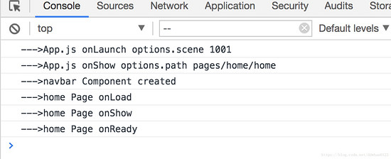
觸發生命周期如圖 也是由內向外計算,渲染,加載
主頁面調用 首先,先添加引用
{
    "usingComponents": {
      "Nav": "../../common/navbar/navbar"
    }
}
然后在頁面里像使用普通控件一樣使用就行了
<Nav tabs="{{數據源}}"></Nav>
總結:網上有許多自定義tab的一些方案,無非就是寫復雜的viewgroup然后用hidfe show替換 或者是改寫swipe來實現。 本文的例子更偏向第一種,但是又有像swipe的滑動動畫 具體的內容分析,之后會補上,這一篇作為開始,先擼個東西,之后再努力做好吧! 源碼等這一系列結束后,放出吧(但是跟著步驟做的話一定是可以把demo擼出來的) |

