|
今天做小程序的時候,碰到一個比較常見的需求,就是要瀑布流布局,兩列,交錯分布,大概如下圖
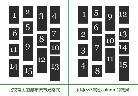
最終要實現的結果就是如左圖所示。
不過在微信小程序里面,不能通過JavaScript來直接操作dome,所以一些常用的方法在這里都沒有辦法用了。這讓筆者非常著急,因為項目比較趕,不能因為這種低級的布局問題拖慢了進度。
百度了半天,發現了css3的column這個屬性,但是最后實現出來的方法就如右圖所示,這不符合需求,需求是兩列,從左到右進行排列的,大概就像小紅書APP那種瀑布流布局

最后筆者終于找到一種非常詭異的方法,哈哈,廢話不多說,直接上代碼
-
<view class="content">
-
<view class="left">
-
<block wx:for="{{note}}" wx:key="">
-
<template is="item" data="{{...item}}" wx:if="{{index%2==0}}"></template>
-
</block>
-
</view>
-
<view class="right">
-
<block wx:for="{{note}}" wx:key="">
-
<template is="item" data="{{...item}}" wx:if="{{index%2==1}}"></template>
-
</block>
-
</view>
-
</view>》
-
<!-- 下面是一個模塊 -->
-
<template name="item">
-
<view class="item">
-
<image class="item-img" src="{{url}}" mode="widthFix"></image>
-
<view class="item-title-box">
-
<navigator url="url" class="item-title">{{title}}</navigator>
-
<image class="arrow" src="../../image/arrow.png"></image>
-
</view>
-
<view class="name">
-
<image class="item-ava" src="{{avatar}}"></image>
-
<text class="name-title">{{name}}</text>
-
<view class="heart_">
-
<image class="heart" src="../../image/heart.png"></image>
-
<text>{{heart_num}}</text>
-
</view>
-
</view>
-
</view>
-
-
</template>
CSS樣式
-
.content{
-
margin: 0 20rpx;
-
text-align: justify;
-
}
-
.item{
-
background-color: #fff;
-
margin: 1%;
-
margin-bottom: 20rpx;
-
display: inline-block;
-
}
-
.item-ava{
-
width: 40rpx;
-
height: 40rpx;
-
border-radius: 20rpx;
-
}
-
.heart{
-
width: 30rpx;
-
height: 26rpx;
-
margin-right: 8rpx;
-
}
-
.heart_
|