微信小程序菜單實現
最近一個月都在做微信小程序,作為一個Android開發者,在這一個月很少寫Android的代碼,真是悲催,好在現在已經完整的把小程序做完了,下周就繼續開始我的Android生涯了,現在回過頭來寫寫自己認為比較常見的一些功能的實現,來幫助小程序學習愛好者學習參考。今天的這篇文章是關于微信小程序菜單的實現,話不多說,上圖。
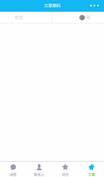
通過效果圖,我們看到,窗口最上面是兩個菜單按鈕,它是固定懸浮在最上面,當點擊時分別顯示狀態選擇和時間選擇,那此處狀態就是我們購物訂單的狀態,有全部,待付款,等,并且當前選中的狀態加上紅色的邊框,讓用戶知道當前的選擇項。那點擊時間時就顯示顯示開始日期和結束日期,當點擊確定時對當前日期時間段的購物訂單進行過濾。
狀態和時間菜單按鈕實現
菜單按鈕實現很簡單,使用display:flex屬性,使用position: fixed將其定位窗口顯示 top: 0;left: 0;懸浮在最上面。上下都加上邊框。
<view class="top-menu">
<view bindtap="showMenuTap" data-type="1">狀態</view>
<view class="line"></view>
<view bindtap="showMenuTap" data-type="2">時間</view>
</view>
樣式
.top-menu {
  display: flex;
  position: fixed;
  height: 80rpx;
  z-index: 10;
  background-color: #fff;
  width: 100%;
  top: 0;
  left: 0;
  align-items: center;
  justify-content: space-around;
  border-top: 2rpx solid #ddd;
  border-bottom: 2rpx solid #ddd;
  font-size: 11pt;
  color: #bdbdbd;
}

.line {
  width: 2rpx;
  height: 100%;
  background-color: #ddd;
}
兩個菜單中間的分割線,我使用了一個view,當然依然可以使用border屬性。在此處給加個z-index屬性。稍后會介紹到他的作用。
彈出菜單實現
<view wx:if="{{menuType==1}}" class="state-menu " hidden="{{!isVisible}}">
<view class="state-item {{status==1?'border':''}}" bindtap="selectState" data-status="1">全部</view>
<view class="state-item {{status==2?'border':''}}" bindtap="selectState" data-status="2">待付款</view>
<view class="state-item {{status==3?'border':''}}" bindtap="selectState" data-status="3">待發貨</view>
<view class="state-item {{status==4?'border':''}}" bindtap="selectState" data-status="4">配送中</view>
<view class="state-item {{status==5?'border':''}}" bindtap="selectState" data-status="5">待收貨</view>
<view class="state-item {{status==6?'border':''}}" bindtap="selectState" data-status="6">待評價</view>
<view class="state-item {{status==7?'border':''}}" bindtap="selectState" data-status="7">退款</view>
<view class="state-item {{status==8?'border':''}}" bindtap="selectState" data-status="8">已取消</view>
</view>
<!--日期選擇-->
<view wx:elif="{{menuType==2}}" class="state-menu" hidden="{{!isVisible}}">
<view class="date">
<view class="classname">開始日期: </view>
<picker mode="date" value="{{date}}" data-type="1" bindchange="bindDateChange">
<view class="classname">{{begin==null?'不限':begin}}</view>
</picker>
</view>
<view class="date">
<view class="classname">結束日期: </view>
<picker mode="date" value="{{date}}" data-type="2" bindchange="bindDateChange">
<view class="classname">{{end==null?'不限' : end}}</view>
</picker>
</view>
<button class="date-btn" bindtap="sureDateTap">確定</button>
</view>
樣式
.state-menu {
  display: flex;
  position: fixed;
  left: 0;
  height: 200rpx;
  top: 80rpx;
  width: 100%;
  z-index: 9;
  background-color: #fff;
  flex-direction: row;
  border-bottom: 2rpx solid #ddd;
  justify-content: space-around;
  align-items: center;
  flex-wrap: wrap;
}
.state-item {
  width: 20%;
  height: 70rpx;
  font-size: 11pt;
  line-height: 70rpx;
  text-align: center;
  border-radius: 10rpx;
  border: 2rpx solid #ddd;
}

.border.state-item {
  border: 2rpx solid #c4245c;
}

.date {
  min-width: 40%;
  display: flex;
  font-size: 11pt;
  color: #bdbdbd;
  align-items: center;
}

.date-btn {
  min-width: 80%;
  font-size: 12pt;
  background-color: #c4245c;
  color: #fff;
}
彈出菜單我們設置高度為200rpx,依然使用position屬性fixed將其固定在菜單按鈕下面,由于菜單按鈕我們設置的高度是80rpx,為了顯示在菜單按鈕下面,我們將top設置為80rpx.flex-wrap指定為wrap作用就是當item超出屏幕寬度時自動換行。由于我們設置狀態的state-item的寬度為20%,所以當顯示四個item時會換新行顯示(五個item100%再加上border會超過寬度,所以第五個在新行顯示(使用box-sizing: border-box,可讓border寬度輸入item的寬度,即item的20%包含border寬度))。
picker 組件是底部彈起的滾動選擇器,現支持三種選擇器,通過mode來區分,分別是普通選擇器(mode = selector),時間選擇器(mode = time),日期選擇器(mode = date),默認是普通選擇器,所以我們在此處設置mode = date。并且可以通過start設置有效日期范圍的開始,字符串格式為"YYYY-MM-DD",通過end設置有效日期范圍的結束,字符串格式為"YYYY-MM-DD"。選擇的日期通過e.detail.value獲得。
透明蒙版效果
當我們使用系統組件picker 彈出選擇器時,我們會看到有一個透明的蒙版效果,那么我們也實現一個蒙版效果
<view class="dialog-mask" style="visibility:{{isVisible ? 'visible':'hidden'}}" bindtap="hideMenuTap"/>
樣式
.dialog-mask {
  position: fixed;
  top: 0;
  left: 0;
  right: 0;
  bottom: 0;
  z-index: 8;
  background: rgba(0, 0, 0, 0.3);
}
我們給蒙版設置了一個點擊事件當點擊時直接隱藏彈出菜單,樣式使用了position:fixed屬性,并將top,left,right,bottom都設置為0,即將蒙版全屏顯示,設置背景黑色,透明的為0.3.此處依然使用了 z-index, z-index是z軸顯示的深度,值越大,離我們越近,即值大會顯示在值小的上面。所以我們將蒙版 z-index設置為8,菜單按鈕設置為10,彈出菜單設置為9.這樣也就看到文章開頭圖中的效果。
動畫實現
通過上面的實現,已經可以達到我們想要的效果,但是顯示和隱藏的時候比較突兀,我們再給它加點動畫,動畫的實現其實很簡單,在這里介紹兩種實現動畫的方式,第一個是直接使用在樣式文件wxss中實現,另一種是通過微信小程序提供的動畫Api實現。
需要注意的是如果添加動畫不能使用hidden屬性顯示隱藏彈出菜單,而是使用visibility,否則看不到動畫效果。
樣式文件wxss實現方式:
.hidden.state-menu {
transform: translateY(-200rpx);
transition: all 0.4s ease;
visibility: hidden;
}
.show.state-menu {
transform: translateY(0);
transition: all 0.4s ease;
visibility: visible;
}
<view wx:if="{{menuType==1}}" class="state-menu {{isVisible?'show':'hidden'}}">
API createAnimation創建動畫方式
微信小程序提供了createAnimation創建動畫,包括平移,旋轉,縮放,傾斜等,并且實現方式簡單,在這里就不在詳細介紹API了,具體可參看官方文檔
//定義變量
var animation
//在page中data中加入變量
animationData: {}
//onLoad初始化變量animation
 var animation = wx.createAnimation({
      duration: 500,
      transformOrigin: "50% 50%",
      timingFunction: 'ease',
    })
    this.animation = animation;

// 執行動畫函數
  startAnimation: function (isShow, offset) {
    var that = this
    var offsetTem
    if (offset == 0) {
      offsetTem = offset
    } else {
      offsetTem = offset + 'rpx'
    }
   //translateY可以加入單位(如20+'rpx'或者20+'vh',不寫單位時默認px),當0時不能加單位,否則動畫無效果
    this.animation.translateY(offset).step()
    this.setData({
      animationData: this.animation.export(),
      isVisible: isShow
    })
  },