|
結果示例圖
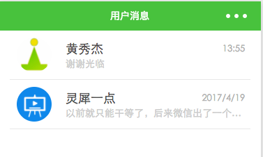
conversation.png
思路
善用flex
對row左右對開
東邊上面對開
東北角左右分散對齊
-
-
class="row" wx:for="{{list}}" wx:key="" bindtap="rowTapped" data-id="{{item.id}}">
-
-
src="{{item.head_img_url}}" />
-
-
class="content">
-
class="top">
-
class="nickname">{{item.nickname}}
-
class="datetime">{{item.datetime}}
-
-
class="bottom">
-
class="sentence">{{item.last_content}}
-
-
-
wxss
-
/*首頁樣式*/
-
-
/*單元行*/
-
.row {
-
display: flex;
-
flex-direction: row;
-
align-items: center;
-
margin: 0 30rpx;
-
border-bottom: 1px solid #e8e8e8;
-
}
-
-
/*頭像*/
-
.row image {
-
width: 100rpx;
-
height: 100rpx;
-
border-radius: 50rpx;
-
margin: 20rpx;
-
}
-
-
/*主體*/
-
.content {
-
display: flex;
-
flex-direction: column;
-
width: 76%;
-
padding-left: 20rpx;
-
}
-
-
/*昵稱與日期*/
-
.top, .bottom {
-
display: flex;
-
flex-direction: row;
-
justify-content: space-between;
-
align-items: center;
-
width: 100%;
-
}
-
-
/*昵稱*/
-
.nickname {
-
color: #4d4d4d;
-
font-size: 36rpx;
-
}
-
-
/*日期*/
-
.datetime {
-
padding: 10rpx;
-
font-size: 26rpx;
-
color: #b2b2b2;
-
}
-
-
/*話語*/
-
.sentence {
-
color: #ccc;
-
font-size: 28rpx;
-
margin-top: 6rpx;
-
overflow: hidden;
-
text-overflow: ellipsis;
-
white-space: nowrap;
-
}
技術點
1.flex
電梯直達:http://www.ruanyifeng.com/blog/2015/07/flex-grammar.html
2.字符串截取
在上述css代碼中
-
overflow: hidden;
-
text-overflow: ellipsis;
-
white-space: nowrap;
用處是將過多的文本變成...,并且只有一占據一行
3.圓角圖標
-
border-radius = width / 2
|