微信小程序swiper滑動頁面實踐-類似于安卓ViewPager
基本屬性
屬性名 類型 默認(rèn)值 說明 最低版本
indicator-dots Boolean false 是否顯示面板指示點
indicator-color Color rgba(0, 0, 0, .3) 指示點顏色 1.1.0
indicator-active-color Color #000000 當(dāng)前選中的指示點顏色 1.1.0
autoplay Boolean false 是否自動切換
current Number 0 當(dāng)前所在頁面的 index
interval Number 5000 自動切換時間間隔
duration Number 500 滑動動畫時長
circular Boolean false 是否采用銜接滑動
bindchange EventHandle current 改變時會觸發(fā) change 事件,event.detail = {current: current}
效果實踐
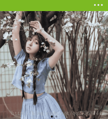
效果一
  <swiper autoplay="True" class="wx-swiper" indicator-dots="True"  interval="2000">
    <swiper-item>
      <image bindtap="tap_d5808da3" class="wx-image" mode="aspectFill" src="https://timgsa.baidu.com/timg?image&quality=80&size=b9999_10000&sec=1493698928333&di=99be91f1067ce820af8235607706813a&imgtype=0&src=http%3A%2F%2Fimg.tupianzj.com%2Fuploads%2Fallimg%2F160412%2F9-160412091538.jpg"
      />
    </swiper-item>
    <swiper-item>
      <image class="wx-image"  mode="aspectFill" src="https://timgsa.baidu.com/timg?image&quality=80&size=b9999_10000&sec=1493698928333&di=ae56672831512cc7d4cd1e26d31269aa&imgtype=0&src=http%3A%2F%2Fimg.tupianzj.com%2Fuploads%2Fallimg%2F160412%2F9-160412091540.jpg"
       />
    </swiper-item>
  </swiper>
wxss樣式如下:
.wx-swiper{height: 750rpx; }
.wx-image{width: 100%; height: 100%; }
其中indicator-dots=”True”表示有指示點;interval=”2000”表示自動切換時間間隔。
效果二
底部是一個view來展示當(dāng)前顯示的item,下面是swiper。
  <view class="swiper-tab">
    <view style="padding-left:5px;" class="tab-list-left {{currentTab==0 ? 'on' : ''}}" data-current="0" bindtap="swichNav">待調(diào)研</view>
    <view class="tab-list-right {{currentTab==1 ? 'on' : ''}}" data-current="1" bindtap="swichNav">已調(diào)研 </view>
  </view>
  <swiper current="{{currentTab}}" bindchange="bindChange" style="height:100%;">
    <swiper-item>
    </swiper-item>
    <swiper-item>
    </swiper-item>
  </swiper>
其中currentTab控制選擇第幾個,0為第一個,1為第二個;swiper-item中為具體布局,可以使用wx:for渲染。 wxss代碼如下:
.swiper-tab {
  text-align: center;
  background-color: #F7F7F7;
  line-height:35px;
}
.tab-list-left {
  font-size: 30rpx;
  display: inline-block;
  width: 25%;
  border: 1px solid #7cba23;
  line-height: 60rpx;
  color: #7cba23;
}
.tab-list-right {
  line-height: 60rpx;
  font-size: 30rpx;
  display: inline-block;
  width: 25%;
  border: 1px solid #7cba23;
  color: #7cba23;
}
.on {
  color: #fff;
  background-color: #7cba23;
}
-
1
-
2
-
3
-
4
-
5
-
6
-
7
-
8
-
9
-
10
-
11
-
12
-
13
-
14
-
15
-
16
-
17
-
18
-
19
-
20
-
21
-
22
-
23
-
24
-
25
js:
Page({
    data: {
       currentTab: 0,
    },
    swichNav: function (e) {
        if (this.data.currentTab === e.target.dataset.current) {
            return false;
        } else {
            this.setData({
                currentTab: e.target.dataset.current
            })
        }
    },
     bindChange: function (e) {
        this.setData({ currentTab: e.detail.current });
    }
....
-
1
-
2
-
3
-
4
-
5
-
6
-
7
-
8
-
9
-
10
-
11
-
12
-
13
-
14
-
15
-
16
-
17
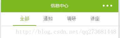
效果三
區(qū)別只是上面的view
<view class="swiper-tab">
  <view class="swiper-tab-list {{currentTab==0 ? 'on' : ''}}" data-current="0" bindtap="swichNav">全部</view>
  <view class="swiper-tab-list {{currentTab==1 ? 'on' : ''}}" data-current="1" bindtap="swichNav">通知</view>
  <view class="swiper-tab-list {{currentTab==2 ? 'on' : ''}}" data-current="2" bindtap="swichNav">調(diào)研</view>
  <view class="swiper-tab-list {{currentTab==3 ? 'on' : ''}}" data-current="3" bindtap="swichNav">講座</view>
</view>
wxss如下:
.swiper-tab {
  width: 100%;
  border-bottom: 2rpx solid gainsboro;
  text-align: center;
  line-height:80rpx;
}

.swiper-tab-list {
  font-size: 30rpx;
  display: inline-block;
  width: 20%;
  color: #777;
}
.on {
  color: #7cba23;
  border-bottom: 5rpx solid #7cba23;
}
-
1
-
2
-
3
-
4
-
5
-
6
-
7
-
8
-
9
-
10
-
11
-
12
-
13
-
14
-
15
-
16
-
17
效果四
在效果二上加了個圓角 wxss代碼如下:
.tab-list-left {
  font-size: 30rpx;
  display: inline-block;
  width: 25%;
  border: 1px solid #7cba23;
  border-top-left-radius: 50rpx;
  border-bottom-left-radius: 50rpx;
  line-height: 60rpx;
  color: #7cba23;
}

.tab-list-right {
  line-height: 60rpx;
  font-size: 30rpx;
  display: inline-block;
  width: 25%;
  border: 1px solid #7cba23;
  border-top-right-radius: 50rpx;
  border-bottom-right-radius: 50rpx;
  color: #7cba23;
}
-
1
-
2
-
3
-
4
-
5
-
6
-
7
-
8
-
9
-
10
-
11
-
12
-
13
-
14
-
15
-
16
-
17
-
18
-
19
-
20
-
21
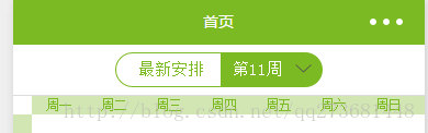
經(jīng)過上述四個效果,微信小程序的swiper基本沒什么難度了。
